
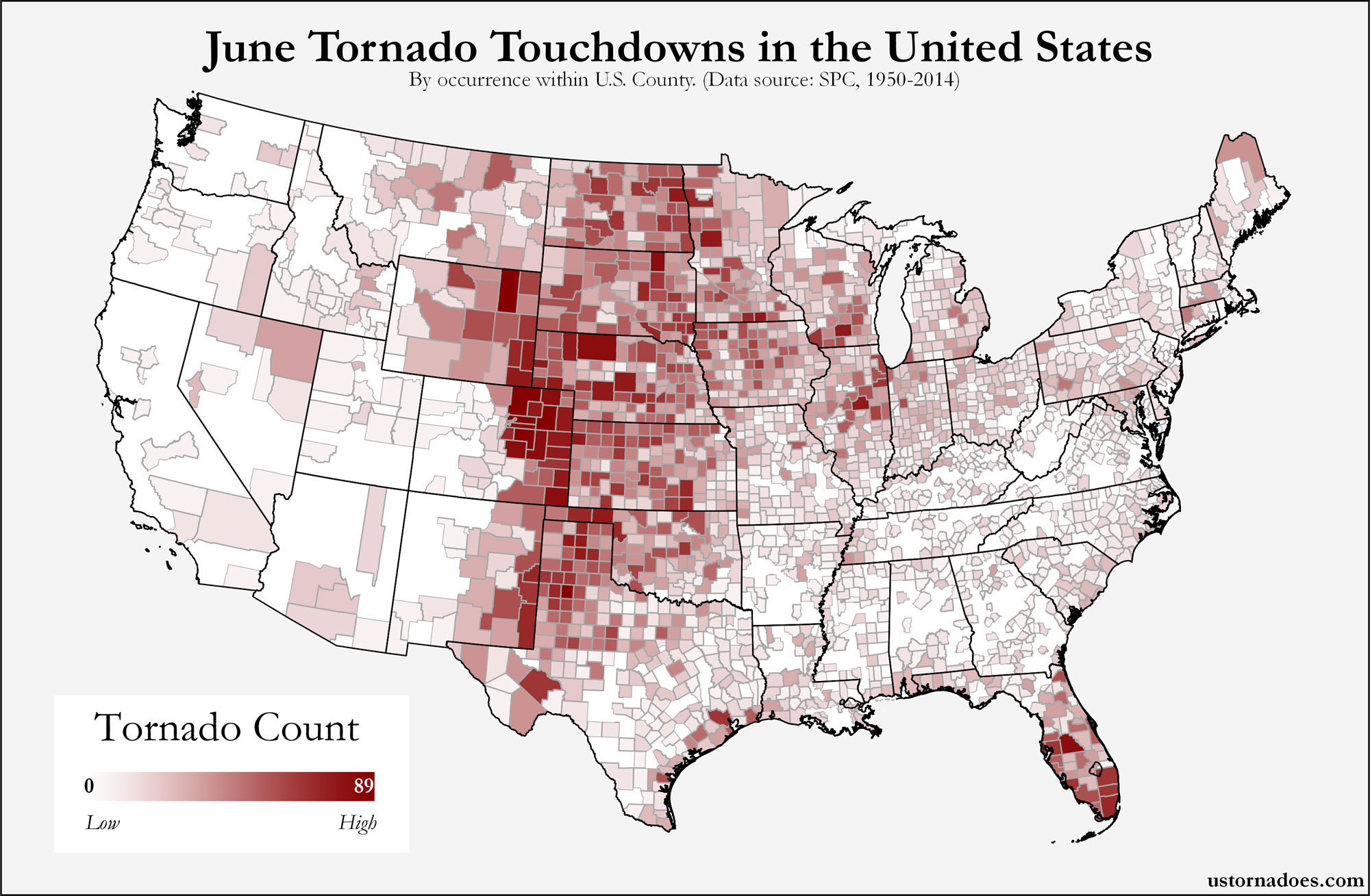
The map above shows county-level impacts of U.S. tornadoes from 1950-2011. In this analysis, if one tornado crosses multiple counties, we have included it as an individual tornado for each county hit.
Moving through April, we see hotspots in Dixie Alley, the Midwest and southern Plains, as well as continued northwest expansion of tornado territory moving into the warm season. Pulaski County, Arkansas led the way during the period with 31 tornado impacts in April. A sampling of other counties that also fall into the highest tornado count for the month includes: Tarrant County, Texas with 30; Johnson County, Texas with 30; Jefferson County, Alabama with 29; Garfield County, Oklahoma with 28; Marshall County, Alabama with 27; and Osage County, Oklahoma with 26.
It is likely that this presentation shows some detail of a handful of large outbreaks that April can be known for. For instance, April 2011 produced almost 20% of the overall county hits in Alabama that have happened over the entire period.
View interactive map » (pops up in sized window — works best in Firefox)
A special thanks to my husband, Jason Wheatley, for his efforts with helping to create this map.
Note: This map was updated on 4/7 after further examination of the data. We have found a number of lat/lon issues and have changed our plotting method to base it on county codes in the database rather than track information. Any changes were relatively minor and in many cases unnoticeable. However, we feel based on the data that this method is the best way to reduce any error present in the SPC database.
Map can be viewed larger by selecting. Data obtained through the Storm Prediction Center. Get updates on U.S. Tornadoes on Twitter and Facebook.
Katie Wheatley
Latest posts by Katie Wheatley (see all)
- March 29-31, 2022 tornado outbreak - April 3, 2022
- March 25, 2021 tornado outbreak - March 25, 2021
- May 3-4, 1999 tornado outbreak and the Bridge Creek-Moore F5 - May 3, 2019
this is great information and everyoine should pay attentoin to the prognostigation that you have writ up. r u on line so i can ichat wiff u?
Hi! I’m glad you like the map. Check back more often for other posts!
Really great map, KT.
Looking at it, it’s curious to see a number of hot spots clustered around spots of increased population density (e.g. DFW, Birmingham, Springfield-Bloomington, Chattanooga, Little Rock).
I suspect that may be attributable to an increased likelihood of tornadoes in those areas being detected, especially earlier in the data sample. Thoughts? Do you know whether the map would look any different if the data was limited to 1990-2011?
Thank you! I can say that 1615 counties were impacted from tornadoes during the 1990-2011 time period (which is 52% of total impacted counties from 1950-2011). Glancing quickly at clusters of tornado points in those impacted counties, it seems counties that have high tornado counts in my map yesterday are high on the list during 1990-2011. I do not have final county counts for the 1990-2011 at this time, but can get back to you on that later.
I do agree with your statement that as the years went on with the advancement of technology and programs like SKYWARN being created, more tornadoes were reported, especially around areas with higher population densities. For example – in 1950 only 16 counties were impacted during the month of April while in 2011 there were 1031 counties that had a tornado touchdown or pass through. Crazy how big of a difference there is!