The Storm Prediction Center recently released the full dataset on the 2012 tornado year, detailing all the tornadoes that touched down across the United States. Preliminary stats have been around for a while, but it takes several months into the following year for them to become official.
SPC has already outlined some of the notable statistics in their “2012 tornado facts” document (and made a nice track map). As we all now know, perhaps the biggest story of the year was the lack of activity. Fewer than 950 tornadoes touched down, way below the 1,690 in 2011.
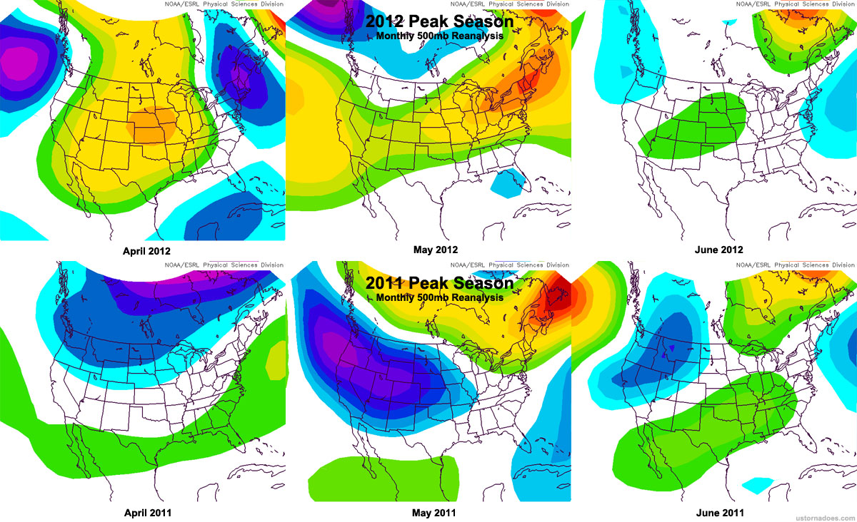
Greg Carbin of SPC noted in the 2012 tornado facts document that the difference between 2012 and 2011, as well as changes within 2012 itself strikingly show just how variable tornado activity can be across the country.
The graph below breaks down both 2012 and 2011 by comparing each calendar month to the NCDC averaging period of 1991-2010.
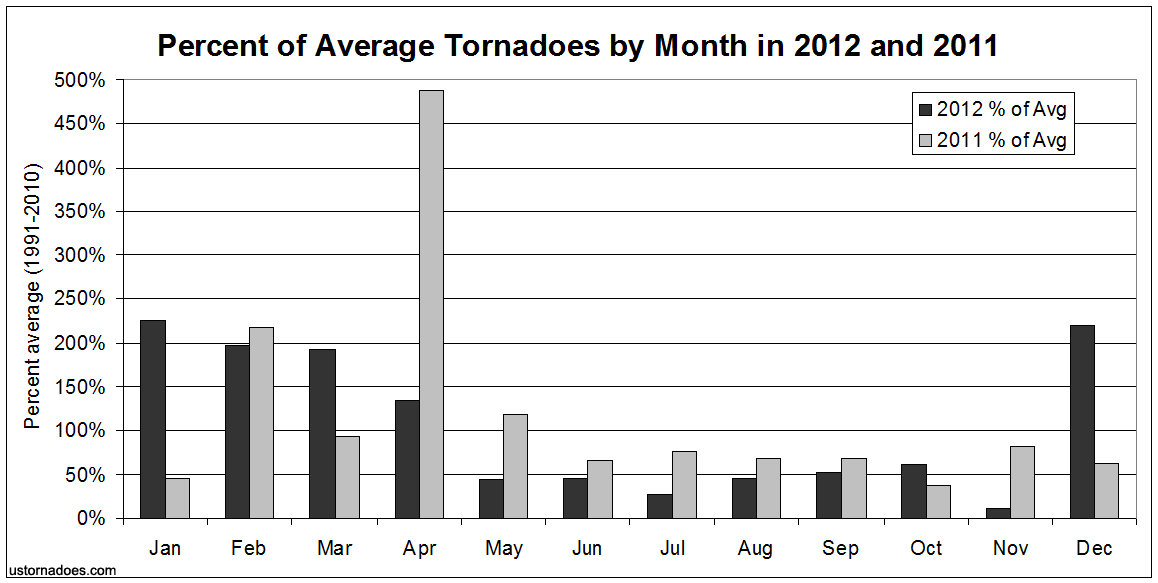
Ideas immediately standing out are that 2012 featured above average activity during mainly “colder” months (in this case, Jan-Mar and Dec). The later spring and summer months all had incredibly low levels of tornado touchdowns, with four months in a row below 50% average, and several months — including July — at near-historic lows.
Though we should not necessarily expect to “bat average” year-to-year given the nature of tornadoes and tornado outbreaks, 2011 similarly featured consistently below normal activity during parts of the usual peak and, really, most of the year. End April (post Super Outbreak) through the first 20 days of May in 2011 is somewhat forgotten as an abnormally quiet period, and many Plains locations did not see abundant storminess throughout peak season.
To look deeper into how the below average and above average numbers of the two years played out across the country, I calculated the percent of average numbers, by state, for 2012 and 2011. The maps below show the differences nicely.
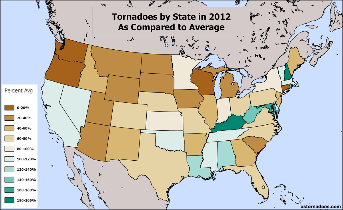
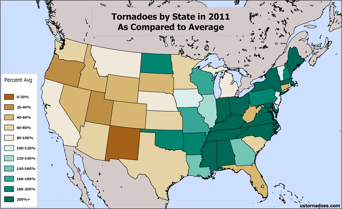
Of course, not all states are created equally when it comes to tornadoes. If you know your big tornado states, both maps tell the tale of the year in question quickly.
Another way of looking at the same information for 2012 follows in the graphs below. I’ve color coded states with 20 or more tornadoes for a yearly average as dark blue, those with 40 or more tornadoes per year black, and the few states with 60 or more average tornadoes red. The lighter blue are all less than 20 tornadoes, in some cases (like NH) way less.
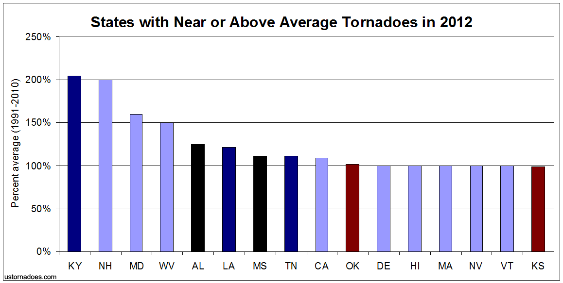
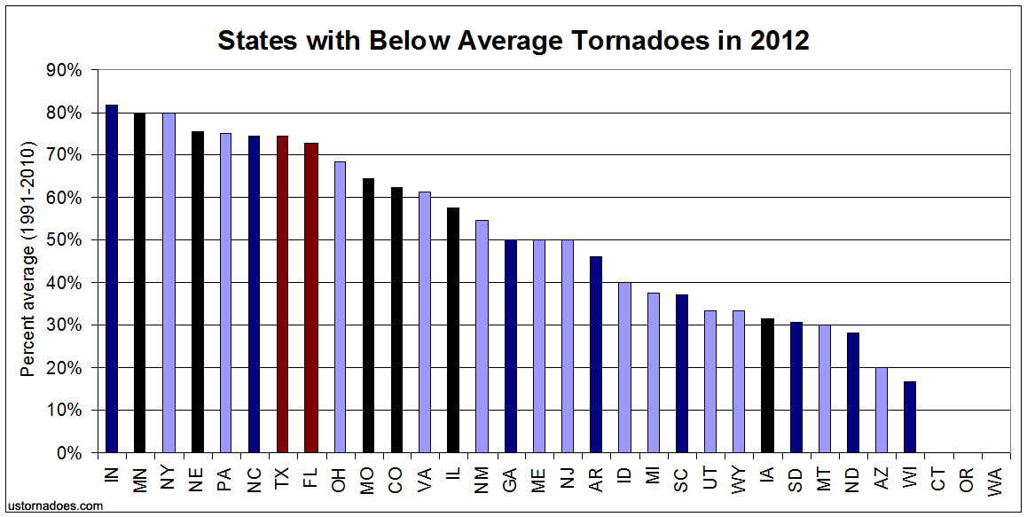
Again, as anticipated for 2012 given the overall numbers, the state comparisons to average are strongly weighted toward below. You’ll also note that the most prolific tornado states were all generally either below average or close to average. Iowa really stands out as lacking in the 2012 tornado department, with just over 30% of its typical in the neighborhood of 50.
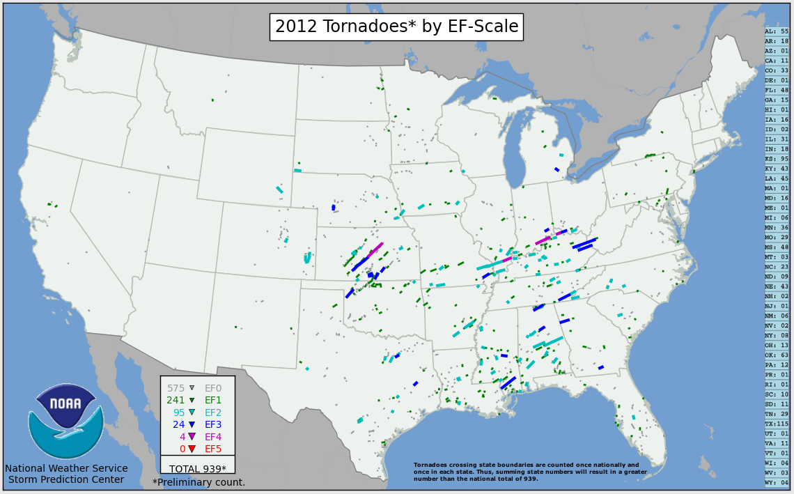
A breakdown of strong tornadoes during both years follows…
2012 Strong Tornadoes (123 total)
EF4 = 4 (4 states)
IN, IL, KY, KS
EF3 = 24 (14 states)
AL, GA, IN, KS, KY, MI, MO, MS, NE, OH, OK, TN, TX, WV
EF2 = 95 (24 states)
AL, AR, CO, FL, IA, IL, IN, KS, KY, LA, MI, MO, MS, NC, NE, OH, OK, SC, SD, TN, TX, WI, WV, WY
2011 Strong Tornadoes (279 total)
EF5 = 6 (4 states)
AL, MS, MO, OK
EF4 = 17 (9 states)
AL, AR, GA, IA, MS, MO, OK, TN, TX
EF3 = 61 (19 states)
AL, AR, GA, IA, IL, IN, KS, KY, LA, MA, MO, MS, NC, ND, NE, OK, TN, VA, WI
EF2 = 195 (27 states)
AL, AR, AZ, CA, FL, GA, IA, IL, IN, KS, KY, LA, MN, MO, MS, NC, ND, NE, NY, OH, OK, PA, SC, TN, TX, VA, WI
Latest posts by Ian Livingston (see all)
- Tornado outbreaks: April, May and June peak-season primer - April 27, 2025
- Busy March for twisters to end with another multi-day event - March 28, 2025
- Everything but locusts: NWS shines in apocalyptic weather - March 17, 2025